For this project, the challenge was to create and imagine a product & packaging concept that helps promote & introduce a more environmentally–awared lifestyle for the American public. The end result of this challenge is Ento – an insect snack brand that aims to introducing insects as a viable and delicious alternative source of protein.
Project Goals
Fun and Engaging
Being a novel product, Ento aims to evoke the feeling of fun and discovery in its branding and packaging.
Flavorful Experience
Ento messaging and visual concept focus on and highlight the wonderful flavor and texture of these snack.
Environmentally Awared
Ento also bring to the forefront the environmental benefits of eating insect to educate the general public about the world of insect-eating.
The journey
Low-level System
The logo mark is designed to evoke quirkiness and boldness, thus utilizing a strong bold sans-serif with some fun tweaks.
The colors are chosen deliberately to suggest fun and personality, inviting the audience to try something new
The typography system use the Epilogue family for its legibility and fun grotesk letter-form that add some personality.
Graphic System
Ento feature edible bug: not the most appetizing thing for a food product, so I went with a different direction for the graphic system.
Focusing on the experience of eating insect, the graphic system utilizes geometric forms that represent the different flavors of an insect.
These form come together to form an insect-like shape that evoke fun and invite the audience to try these delicious snack out.
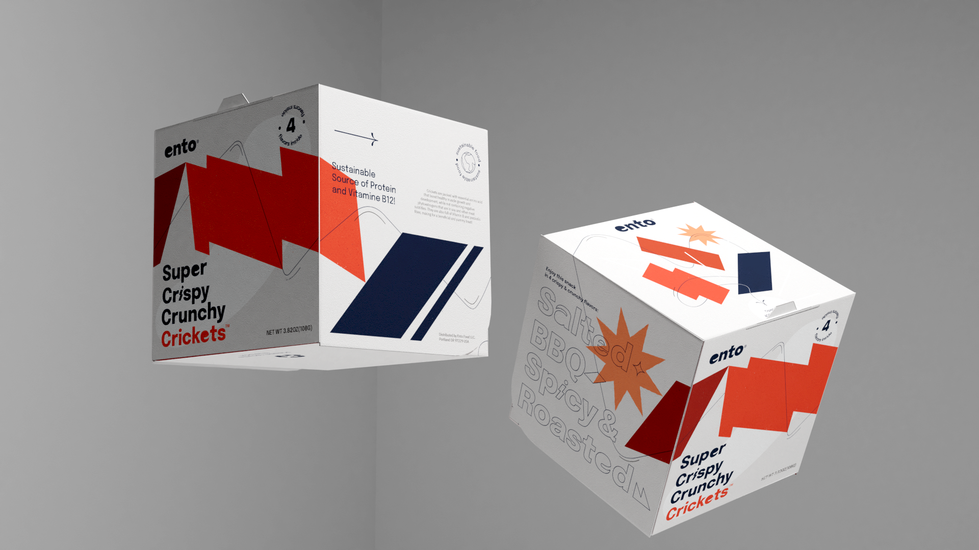
Packaging Experience
The packaging is restricted to a 4'x4' box that contained 4 different flavor of an insect, in this case it's the cricket.
The box has an engaging experience that create a color-pop when you open it, with a wing-like openning mechanism.
Designed to evoke the sensastions of eating these insect snack, the graphic and typography come together to suggest a flavorful experience
The graphic system is also wrapper around the packaging to create an interesting 3-dimensional experience, and the typography is blended with geometric shapes that suggest the flavor within.
The system can also extend to beyond the product and onto marketing materials. Notice the focus of the copy on the environmental impact and especially the flavorful experience of these insect snack.
The Conclusion
The project managed to create a fun, engaging and interactive brand experience from packaging to marketing that focus on the environment and dispelling the taboo against eating insects.