The story of Shleep Kit
03 / 12
The Challenges
This project challenge was to imagine a product that "bring back the magic of sleep to the modern life." In addition to that, the key concept was to associate the magic of dreams to sleep-aiding / sleep-enhancing products that are organic and suitable for day-to-day use. Thus, Shleep was born. An attempt to help sheep-counting humans find their good night sleep. Through an online subscription service, Shleep deliver a Shleep Kit and refills-on-request every month that feature organic and natural ingredients.
Project Goals
-
A magical experience
The playful and mystical experience of a classical story-book should be recreated and modernize
-
Soothing to the eyes
The core brand must create a sense of peacefulness to the audience.
-
Organic ingredients
This project must highlight the natural ingredients from each product as a important selling-point.

The journey
Low-level System
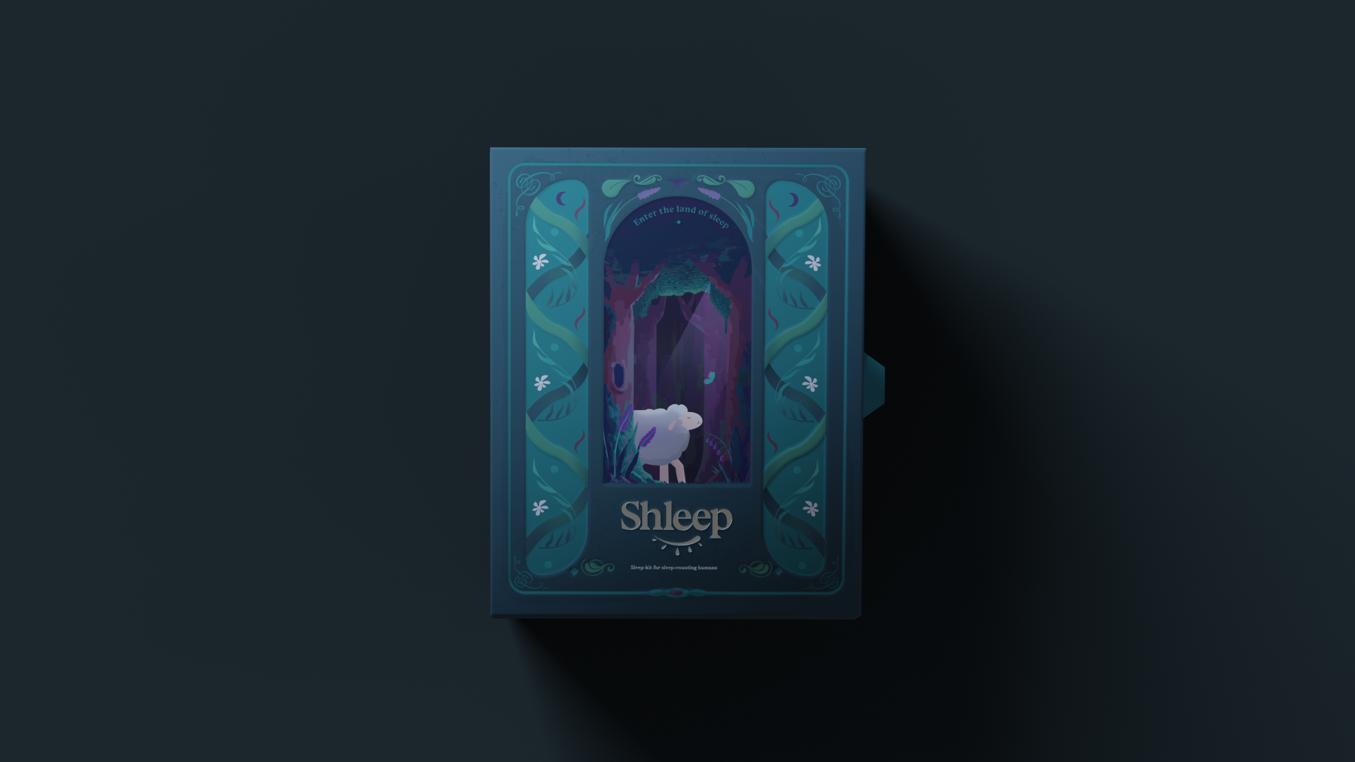
The logo mark focused on the typography (featuring a hard, quirky serif) and a symbol eye-lash-like mark that represent sleep, tea-drops and the half-crescent moon
The color thus follow suit, showcasing a wide range of hues (lavender,teal,mustard, and pearl white) that pop but remains soothing to the eyes.
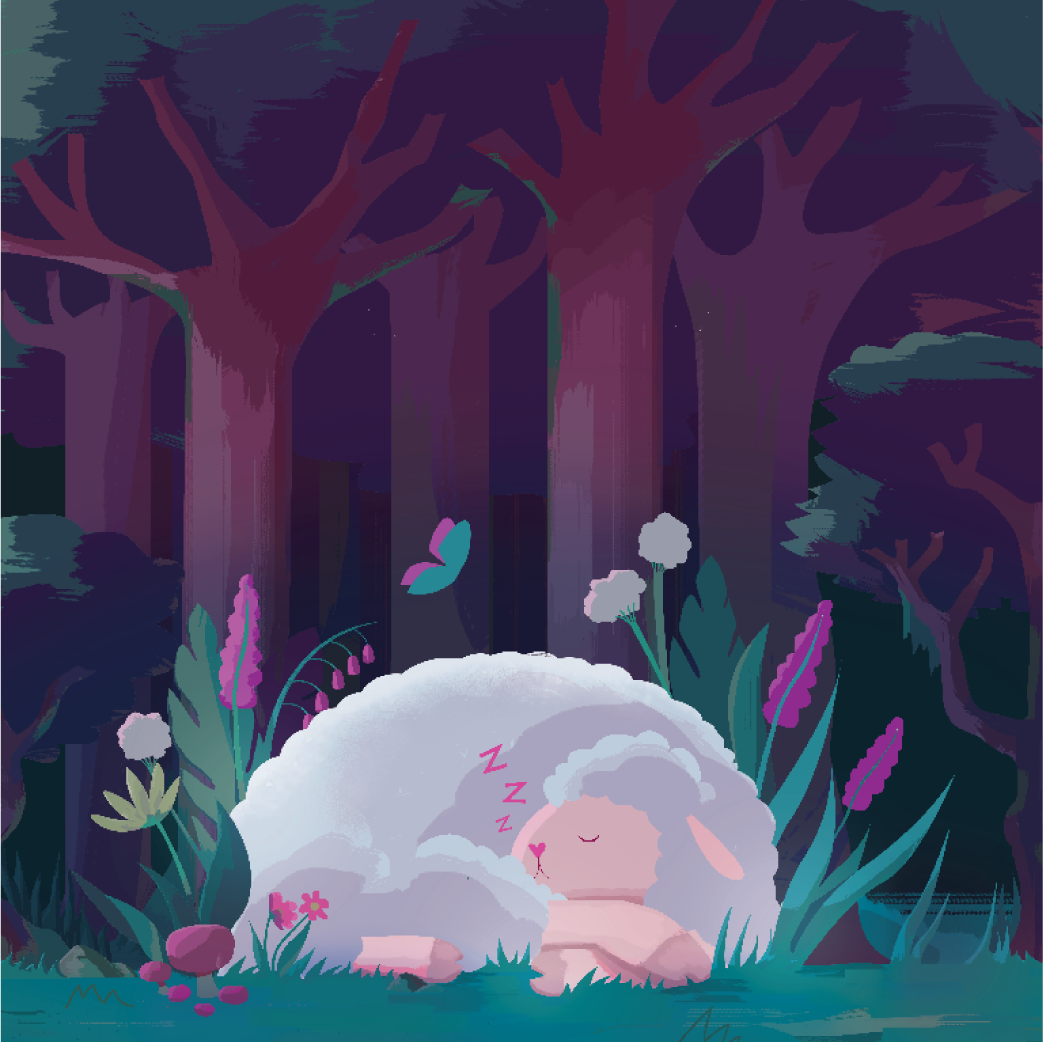
The main illustration also feature the brand's mascot sleeping, and a whole range of organic plants and herbs, suggesting a mystical amd magical experience.


The packaging for the kit is envisoned to be a kind of magical story-book, and open like a book. As such, the copy is crafted to look like text from a classic book, with a adventure-book voice and set a magical tone. The product boxes are inspired from illuminated manualscript with boxed-in flourishes and decorations. Working together, they form a cohesive system that suggest discovery and exploration of the packaging.


Individual Product box
Each product feature a key illustration that highlight the ingredient, which is also echoed by a simplified line-art when the box is opened.
The name of the product is stylized: "The Salt of Lavender" for Lavender bath-bomb or "Cottoned peace" for cotton earplugs.
The typography and composition is minimal and simple to not only clarify the content but also create contrast against the other packaging system.


The Conclusion
The final result is a cohesive system that bespeak the magical experience of sleep and frame the product in an interesting narrative that captivates and invites the audience for a sleepful adventure.
Next project:
04 / 12
Scopee App
Shleep Kit